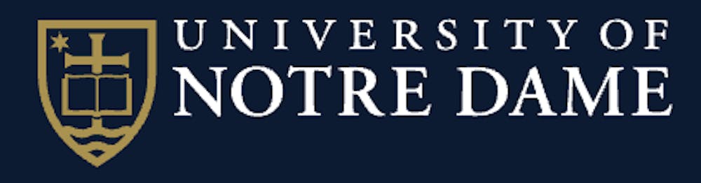
In recent months, those viewing Notre Dame’s website and social media presence may have noticed a simplified version of the University’s crest which does not include the Latin phrase “vita, dulcedo, spes.” The phrase, which appears on the seal of the University beneath a cross, translates to “life, sweetness, hope” and is taken from the “Salve Regina” prayer. This change in branding is part of an effort to emphasize the University’s Catholic identity according to director of design and brand identity Tim Legge.
Legge explained the Latin phrase in the crest “is most definitely an important component of the University seal, and will never be phased out.” Instead, the University is trying to make a more functional version of the crest which is “reflective of ongoing communication needs.”
According to Legge, the Latin words will still be included in the “primary academic mark” of the University when it is above two inches in length. It will also be included in printed material for important official University events, such as commencement, as well as on the Latin seal which is used in communications by the Office of the President.
When the primary academic mark is smaller than two inches long, however, and when the space calls for the use of the vertical simplified academic mark, “vita, dulcedo, spes” will be omitted from the seal. This includes the University’s website and social media profiles, as well as much printed marketing material.

The main motivation for this change, Legge explained, was that the words simply weren’t legible when viewed at a smaller scale. He continued that without the Latin in the crest, the academic mark can be better incorporated into marketing material and embroidered apparel.
More broadly, moreover, the University is seeking to create an easily identifiable mark for the University other than the “ND” monogram used for Notre Dame athletics. Legge said the crest better represents the University’s Catholic identity, due to the fact that it includes a cross. He also argued it creates a more professional look when Notre Dame interacts with other elite universities. Legge said the desire to focus on the Catholic identity of the University was informed by the Notre Dame 2033 Strategic Framework.
“Everything we’re doing with the institutional brand is directly in line with the strategic framework agenda,” he said.
Legge explained that the branding team conducted focus group studies with alumni, people loosely affiliated with Notre Dame and people with no affiliation with the University to help determine the primary academic logo of the University. All groups were shown a “what would you fight for” promotional video with differing logos, and all three groups preferred the logo with the crest over the “ND” monogram as the best representation of the University’s mission.
Now that the University has decided upon the crest as the primary feature of its academic mark, it is seeking to promote its use across academic departments and colleges, Legge said.
“We should look like one institution,” he said.
Legge also noted that the University will be revamping its “On Message” website this year to reflect the new branding guidelines.